Untangling Conversations
Feb 12, 2025
Kalido
How separating replies from threads transformed Kalido's chat thus reducing confusion by 68% and turning silent users into active participants
How separating replies from threads transformed Kalido's chat experience
Every reply created a new conversation.
Users were so afraid of "conversation spaghetti" they stopped talking altogether.
The Problem:
Users Were Afraid to Reply
Kalido's chat had a fundamental design flaw: every reply automatically created a new thread. Say "thanks" to a teammate? New thread. Ask a clarifying question? New thread. The result was what users called "conversation spaghetti."
68% of users were confused about basic reply behavior. 45% had stopped replying altogether, they'd rather stay silent than contribute to the chaos.
Support was drowning. Messaging and Threading generated more tickets than any other feature. Not bugs though, just confusion about how replies worked.
But the real cost wasn't support load.
It was participation. Teams were abandoning Kalido's chat entirely, using it as an HRMS while communicating elsewhere.
User quote:
"I just wanted to thank Sarah for her update, but suddenly I'm in a whole separate conversation. It's like being forced into a private room when you just wanted to wave."
Role & Context
Redesigning Chat Architecture
The Challenge:
How might we let users choose between quick responses and focused discussions without creating conversation chaos?
My Role:
Product Designer (solo design)
What I Did:
Led user research across 24 users (power users + confused users)
Designed complete visual hierarchy system (avatars + conversation types)
Created and iterated prototypes from low-fi to high-fi
Managed stakeholder alignment across engineering, product, and leadership
Developed phased rollout and user education strategy
Team:
1 Designer, 2 Engineers, 1 PM
Our Research Insights
Four Problems, One Root Cause
I interviewed 24 users:
Power users who'd developed elaborate workarounds
Casual users who were just confused.
The patterns were clear.
1. Context Collapse
Users lost track of conversations when everything became a thread. One person used emoji reactions instead of replies just to avoid creating threads. Another copy-pasted quotes manually rather than use the reply function.
"I just wanted to say 'thanks' but ended up in a whole separate conversation."

2. Navigation Nightmare
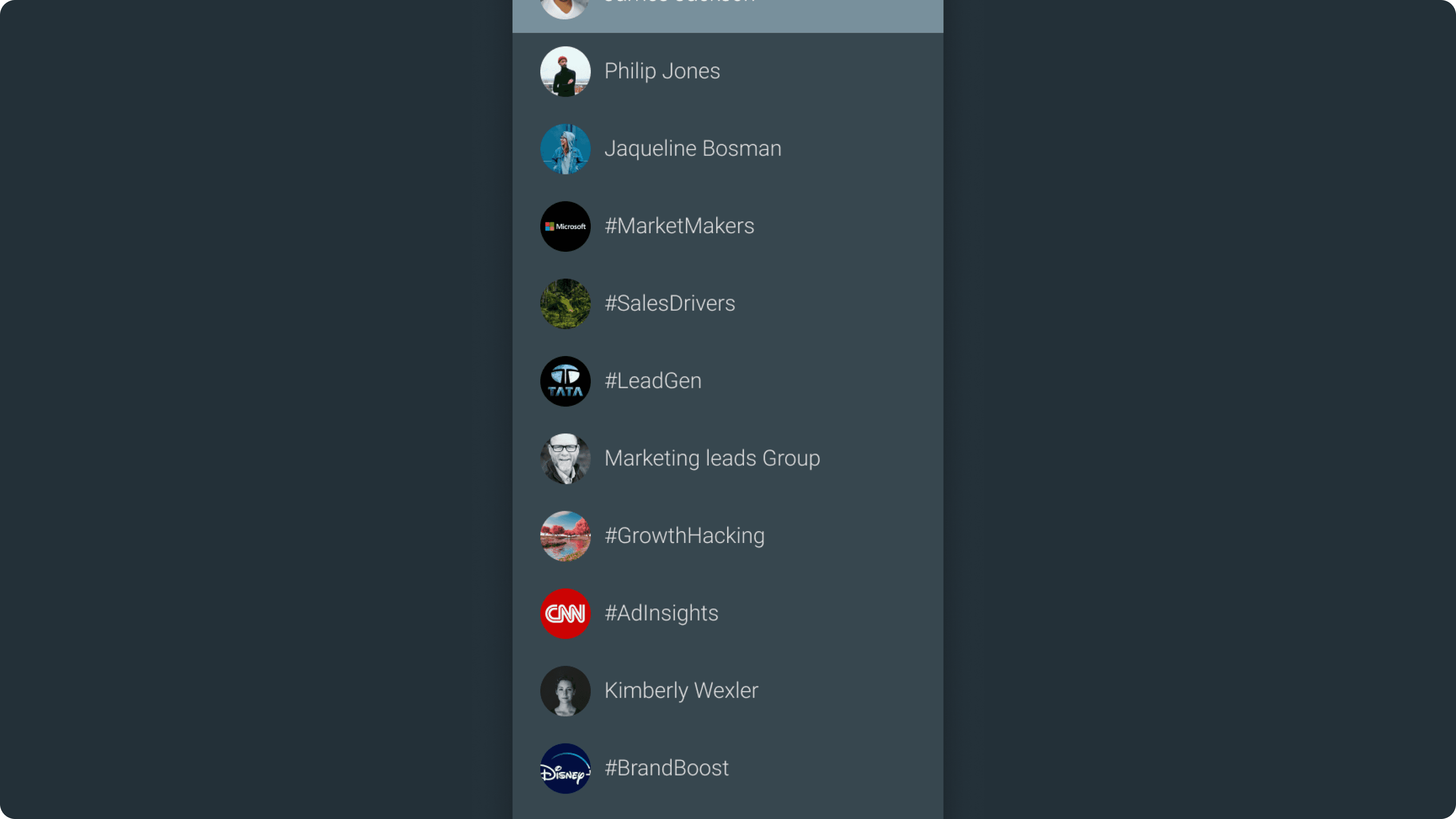
12% of messages were being sent to the wrong chat. Users couldn't distinguish between team channels and social groups because everything looked the same, just a sea of circular avatars.
"I keep posting team updates in my group chat by mistake."
3. Platform Inconsistency
A reply-to-reply on mobile showed as a reply to the original message on desktop. Your response to John would appear as a response to Sarah on another platform. The mental model was broken.
Notification Overload
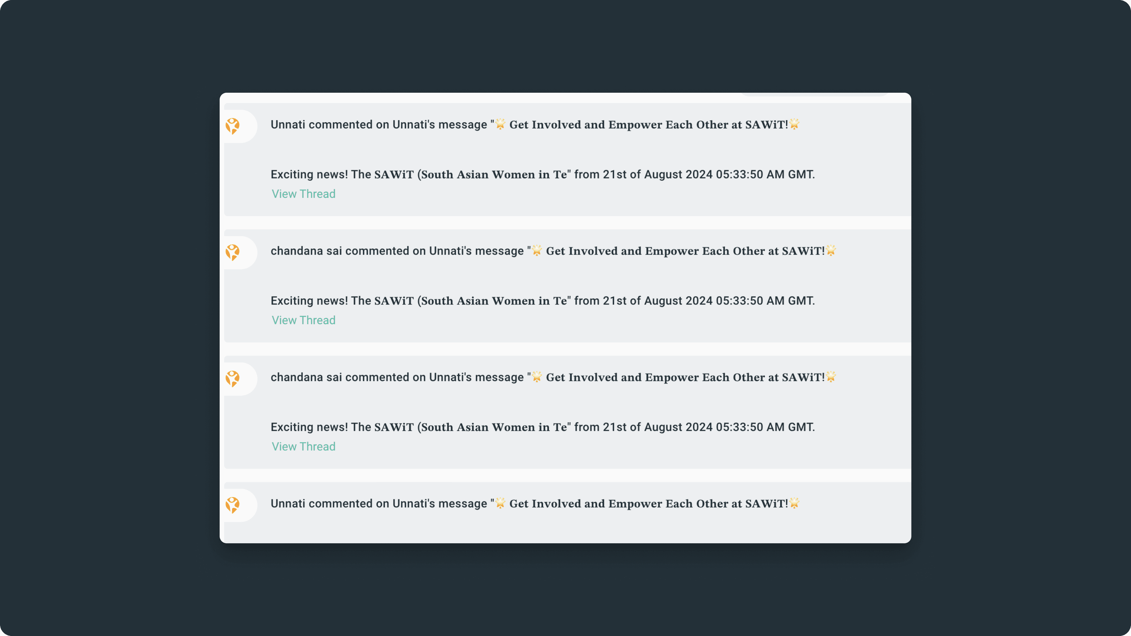
When a thread got active, chat receipts (notifications) from that thread would flood the main chat. Every reply in a busy thread generated a notification preview in the parent conversation. A 20-message discussion about a project deadline meant 20 chat receipts cluttering the main chat. Users couldn't tell what was a real message versus thread noise. The very feature meant to organize conversations was drowning them.
The Reframe
Replies ≠ Threads
The breakthrough came during a design workshop when we asked: What if replies and threads were completely separate actions? It sounds obvious now, but it was revolutionary thinking for us.
We'd conflated two different user needs. Sometimes you want to say "great job!" and sometimes you want to start a deep discussion about project strategy. Our system treated both the same way.
The Framework:
Quick acknowledgment → Use Reply (lightweight, stays in main chat)
Focused discussion → Start a Thread (dedicated space, own lifecycle)
Side conversation → Reply Privately (no clutter)
Design Principles:
Intentionality: Users choose when to create focused discussions
Clarity: Visual and functional distinction between replies and threads
Flexibility: Support both quick responses and deep conversations
Think of it like email:
You don't create a new thread every time you reply. Sometimes you reply inline, sometimes you start a new thread. That's the mental model we adopted.
The Solution Overview
A Three-Part System
During research, we discovered users couldn't even find the right chat to have conversations in. So we designed a holistic system, not just fixing replies, but reimagining chat from navigation to conversation.
Part 1: Visual Hierarchy
Shape-based system to instantly distinguish chat types. Rectangular avatars for organizational spaces (networks, channels, teams). Circular avatars for people (DMs, group chats).
Part 2: Reply System
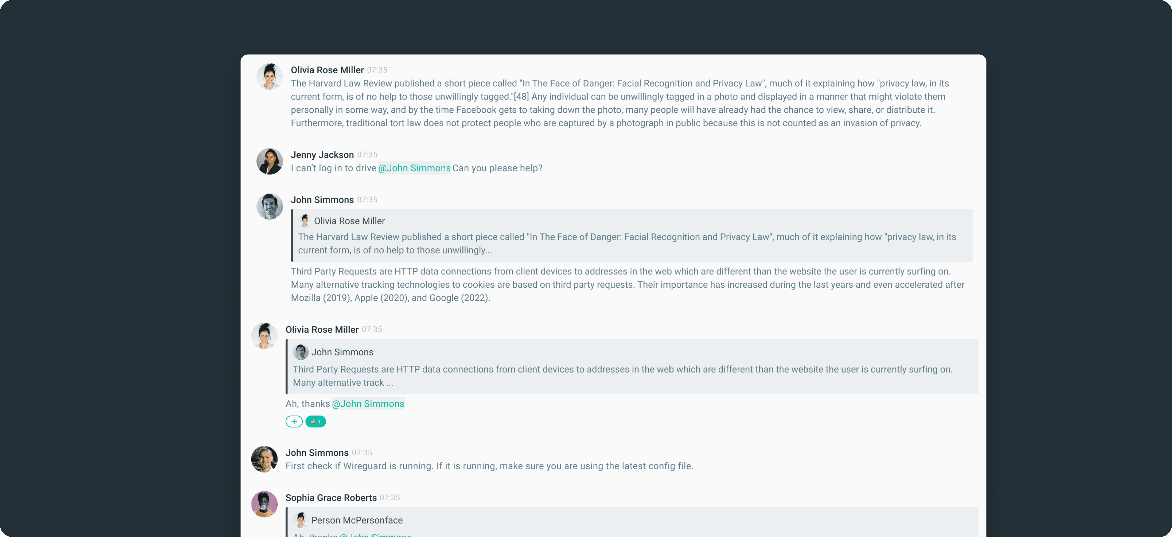
Lightweight inline responses with clear quotations. Replies stay in the main chat, maintain visual connection, and support reply chains without spawning threads.
Part 3: Thread System
Intentional, focused discussions with their own space. Optional titles and tags, dedicated panels, smart activity management.
These three parts work together:
Clear navigation gets you to the right chat. Simple replies handle quick communication. Powerful threads enable deep work.
Visual Hierarchy
Shape as Language
Users couldn't scan 100+ chats and know which were work-related versus personal. The 12% wrong-chat rate wasn't a user error, it was a design failure.
The Solution:
Rectangular avatars → Organizational spaces (networks, channels, teams)
Circular avatars → People (DMs, group chats)

It seems simple, but it was transformative. Users could instantly parse their entire chat list without reading a single label. The shape told the story before their eyes processed text.
User feedback:
"Finally, I can tell my chats apart at a glance!"
"This is such a small change but it makes everything clearer."
Result:
Wrong-chat rate dropped from 12% to near zero
Replies & Threads
Two Tools, Two Jobs

Replies: Lightweight by design
Stay inline with clear quotations
Support reply-to-reply chains
No separate space needed
Curved arrow icon + subtle blue = "this is simple"
Threads: Intentional and purposeful
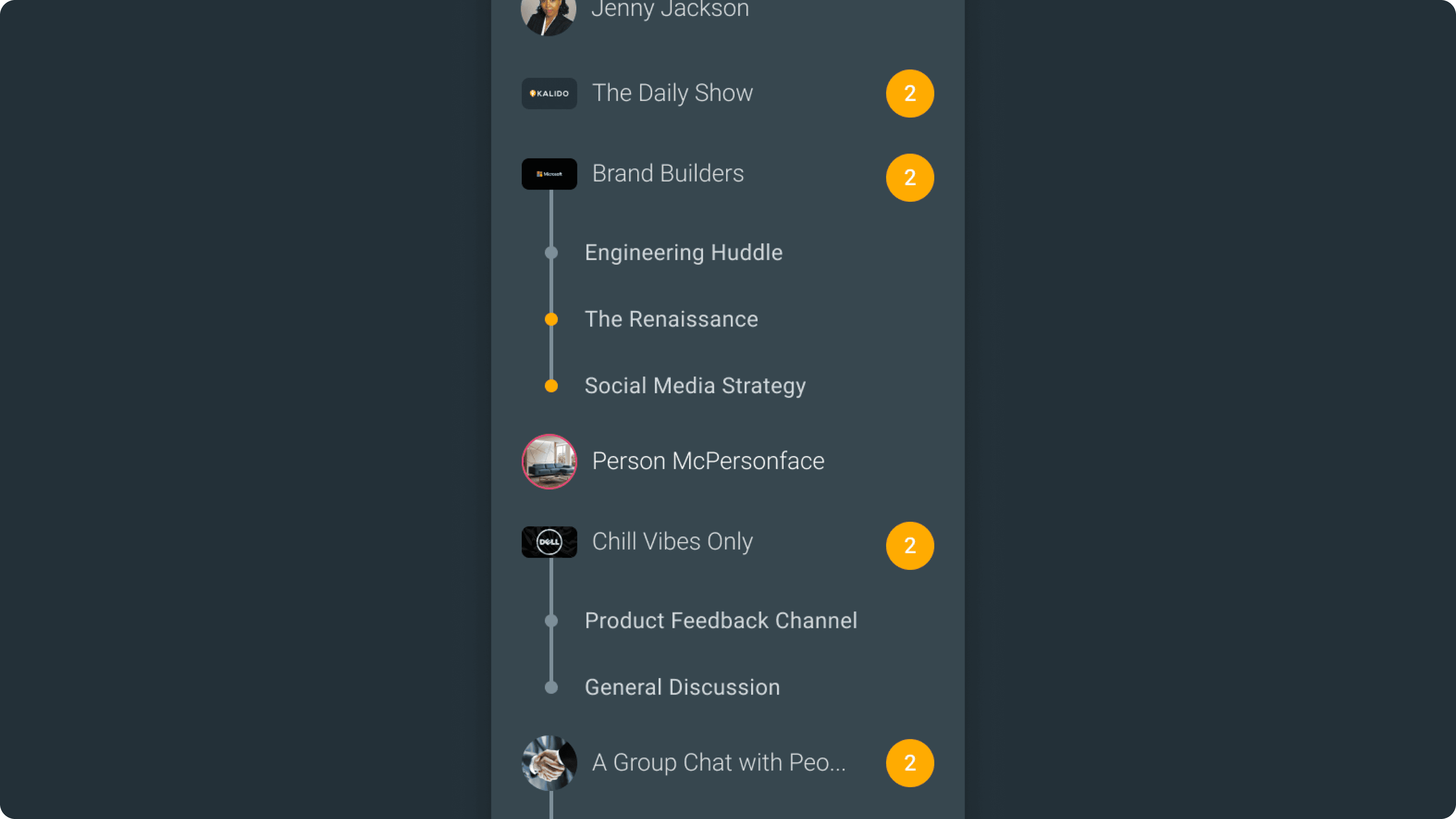
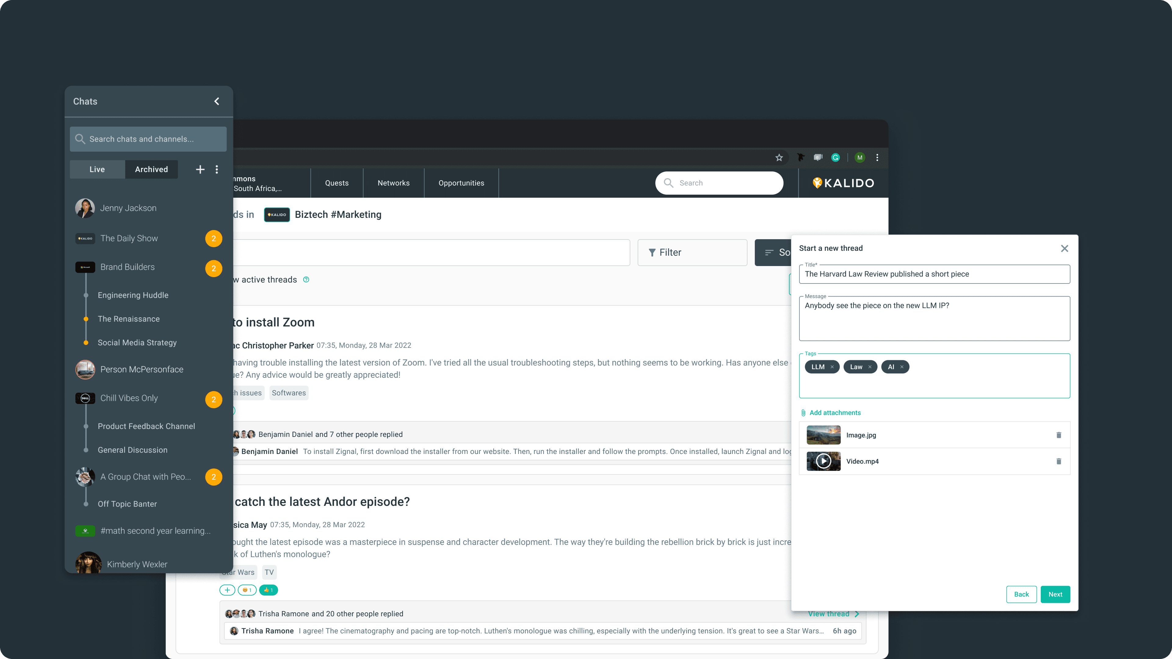
Opens a dedicated dialog
Auto-generated titles (customizable)
Tags for organization
Threads appear nested under their parent channel or group chat in the left panel — so you always know where a conversation belongs
The visual language matters:
Different icons, different colors, different affordances. Users should instantly understand which action does what without reading instructions.

Solving the Zombie Thread Problem
Threads Have Lifespans
Here's an insight from user research: threads are like conversations at a party. Some are vibrant and active, others naturally fade away. But in digital spaces, threads lived forever, creating what users called "zombie threads." Technically alive, practically dead.
The innovation: By default, if there's no activity for 7 days, a thread becomes inactive. It doesn't delete but it just stops appearing in your active list. But users control this threshold. Customer support might want 3 days. Long-term strategy might want 30.
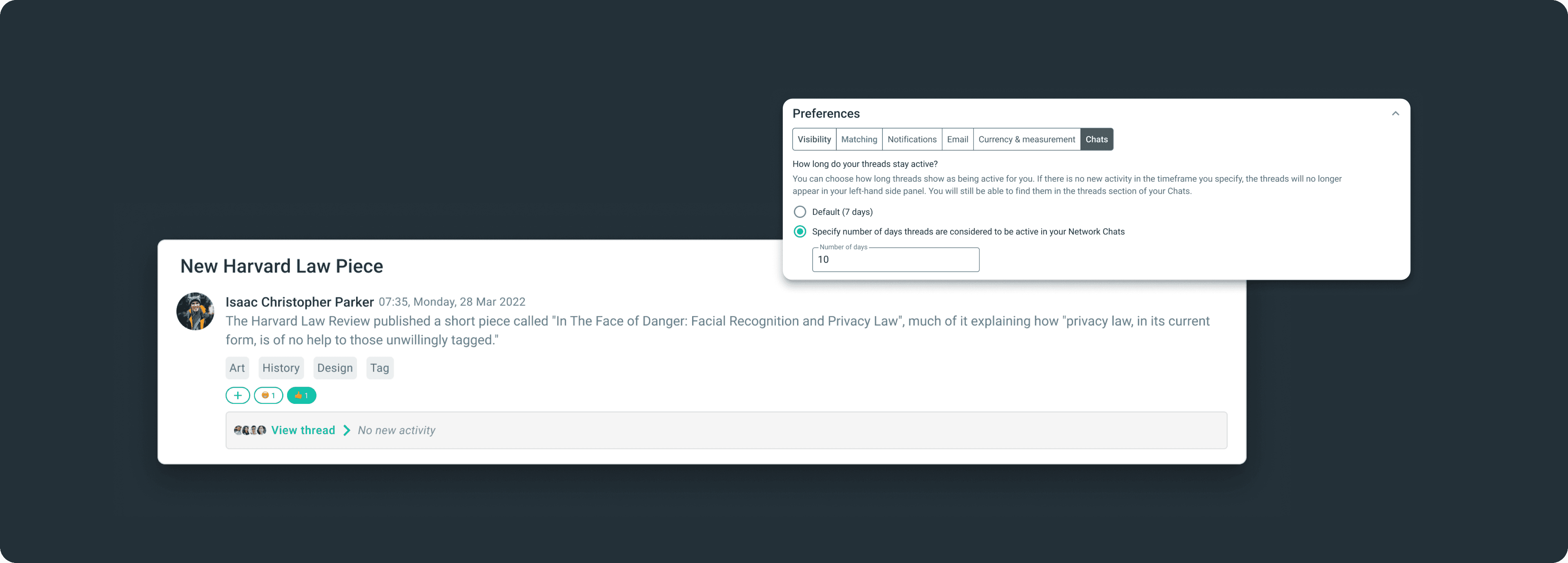
How it works:
Active threads you're part of appear in sidebar
Inactive threads gracefully disappear but remain searchable
Notifications only for truly active discussions
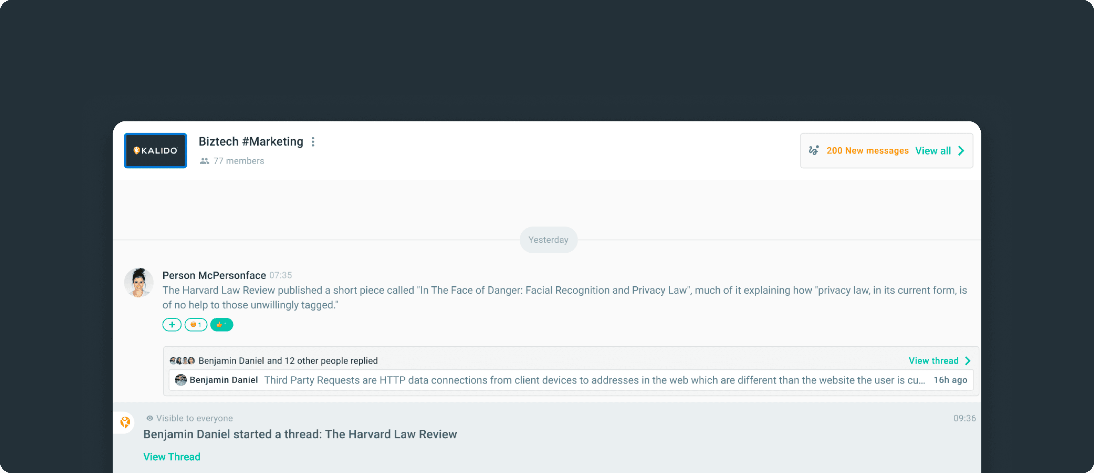
This solved multiple problems at once. The sidebar stayed clean. Notifications became meaningful. And psychologically, it gave users permission to let conversations end naturally.
Turning Skeptics into Champions
The Avatar Battle
Stakeholder alignment was make-or-break. Engineering saw scope creep. Product worried about transition confusion. But the biggest battle was with leadership over the avatar system.
Our leadership believed in strict visual consistency: "Everything should be circles. That's our brand." I understood the concern, but users needed visual differentiation.
My approach:
Instead of arguing, I proposed a small A/B test. "Let's ask 10 users and see what they say."
We asked our users to find specific chats, things like "Open your marketing team channel" or "Find your DM with Sarah." With the old design (all circles), users hesitated, scrolled, squinted at labels. With the new design, they scanned and selected almost instantly. The rectangular/circular distinction let users parse their chat list without reading text.
The turning point:
The data was undeniable: task completion was significantly faster, and 100% of users preferred the new system.
In the leadership meeting where I presented results, our leadership said: "We were wrong. Consistency in user experience matters more than consistency in shape."
They became our biggest champion, even presenting the avatar system at a company all-hands as an example of user-centered design.
The Results
From Confusion to Conversation
Message Volume
Daily messages: 2,400 → 3,800 (~58% increase)
Teams actually started communicating on Kalido instead of treating it as "just an HRMS"
Thread Quality
Thread creation dropped 40%, but that was the point
Threads that were created averaged 12+ messages (vs. 3 messages before)
Fewer "thank you" or "got it" threads, those stayed as lightweight replies where they belonged
Navigation Accuracy
Self-deleted messages dropped 64%
Users were finding the right chat the first time, no more "oops, wrong channel" corrections
The numbers told one story, but the behavior shift told a bigger one. Teams stopped context-switching to Slack or WhatsApp. Conversations that used to happen outside Kalido started happening inside it.


