Redesigning How Recruiters Evaluate Talent
Mar 2, 2025
Kalido
Recruiters compare, not evaluate in isolation. We rebuilt the candidate evaluation system around that insight.
Redesigning How Recruiters Evaluate Talent
Recruiters don't look at one candidate and decide. They look at ten and compare. Skills, availability, location, salary, all weighed against each other. But our interface showed one candidate at a time. So recruiters did what anyone would do: they left. Exported to Excel. Screenshotted into PowerPoint. Built their own comparison views outside the product.
We redesigned the system to match how recruiters actually work.

My Role:
Sole designer owning research, UX architecture, and interaction design. Partnered with engineering on technical constraints and pushed for features that weren't initially on the roadmap.
Team:
1 Designer, 1 Product Manager, 2 Engineers
Timeline:
3 months
Impact:
72% reduction in CSV exports, 3.2x more candidates reviewed per session
The Context:
What is Kalido?
Kalido is an enterprise talent platform. It matches candidates (internal employees or external applicants) to job opportunities called "Quests."
For each Quest, the system generates a list of matched candidates, scored on how well they fit the role's requirements: skills, certifications, band level, location, salary, availability, and more.
Recruiters review these matches, shortlist candidates, and move them through the hiring process, all within the platform.
The Problem:
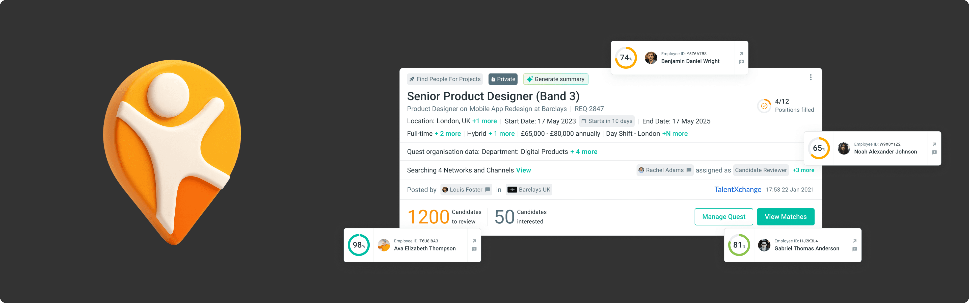
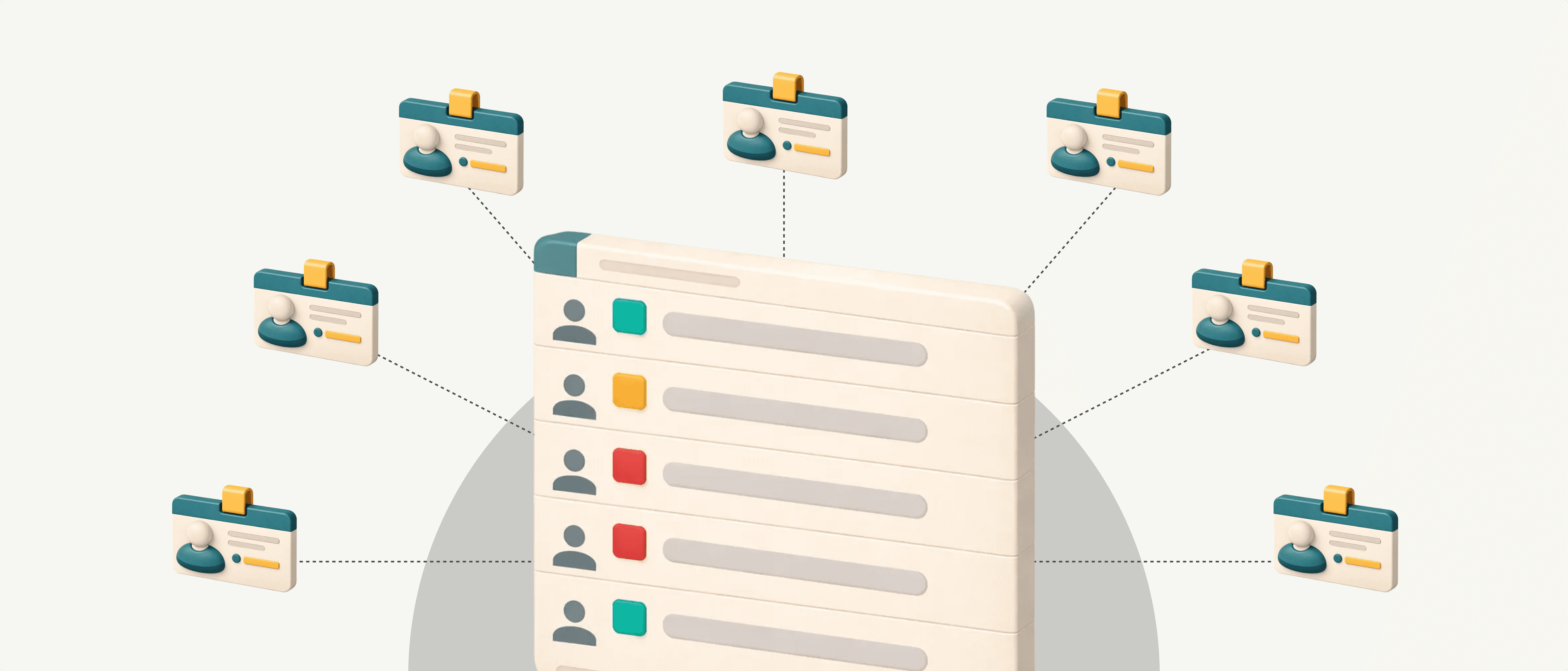
The Card That Ate the Screen.
The original match cards were designed to be simple. Show the candidate, show their score, show how they meet the requirements. Let recruiters act.
When a Quest had a handful of requirements (role title, band level, location) the card was compact and scannable. You could see 3-4 candidates on screen at once. It worked.
But Kalido's matching engine kept getting smarter. Clients wanted to match on more dimensions:
Shifts and preferred working hours
Remote vs. hybrid vs. onsite preferences
Salary expectations
Industry experience
Custom organisation data
Each new parameter improved matching accuracy. Each one also added another section to the card.
Eventually, one expanded card consumed the entire screen. Comparing two candidates meant scrolling back and forth, trying to hold details in your head. Comparing five meant leaving the product entirely.
Recruiters started exporting to Excel, screenshotting into slides, building their own views outside the tool.
More Data, Less Clarity
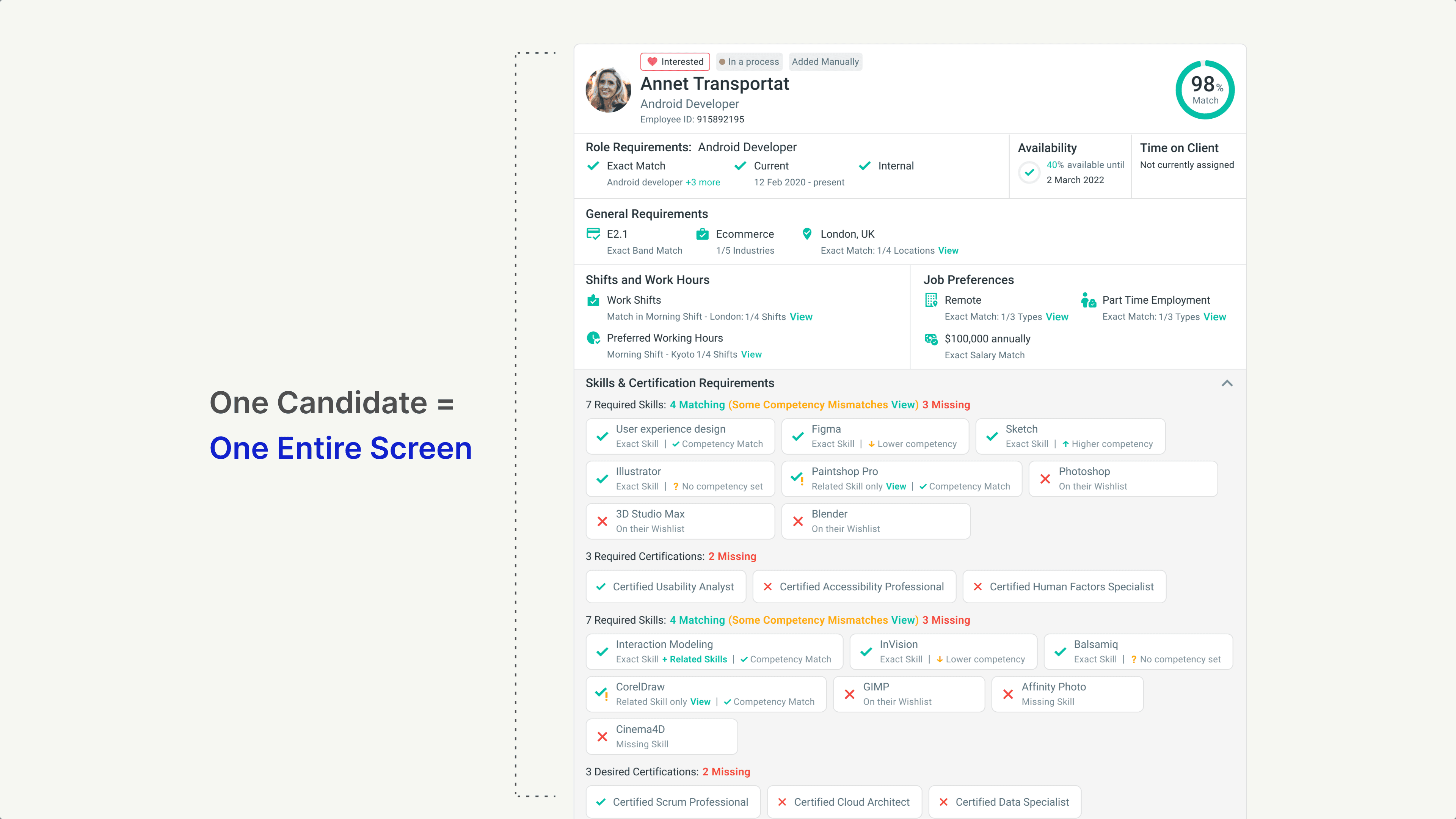
The card grew from a glanceable summary to an endless scroll.
Skills alone could have 10 required items and 12 desired items, each showing match status, competency level, and source. Certifications added another layer. Shift preferences, salary, job type all stacked vertically.
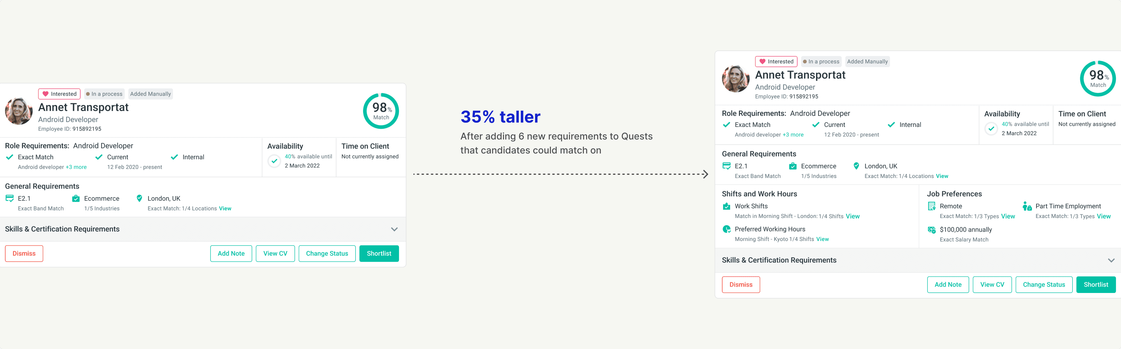
To see everything about one candidate, recruiters had to expand the card fully. That single card now consumed the entire viewport. The "match list" became a list of one.
Seeing multiple candidates at once was impossible. Comparing candidates on a specific requirement meant scrolling, remembering, scrolling back, and forgetting.
The interface that was supposed to help recruiters make decisions was now the biggest obstacle to making them.
What We Learned
Every Recruiter Has a Different "What Matters"
We spoke with around 20 recruiters to understand how they actually evaluated candidates. One pattern kept showing up: no two recruiters prioritized the same things.
For a technical role, one recruiter cared most about skills match and certifications. For a regional role, another prioritized location and shift availability. For a senior hire, band level and salary expectations came first.
When we asked what they wanted to see in the match interface, the answers varied wildly:
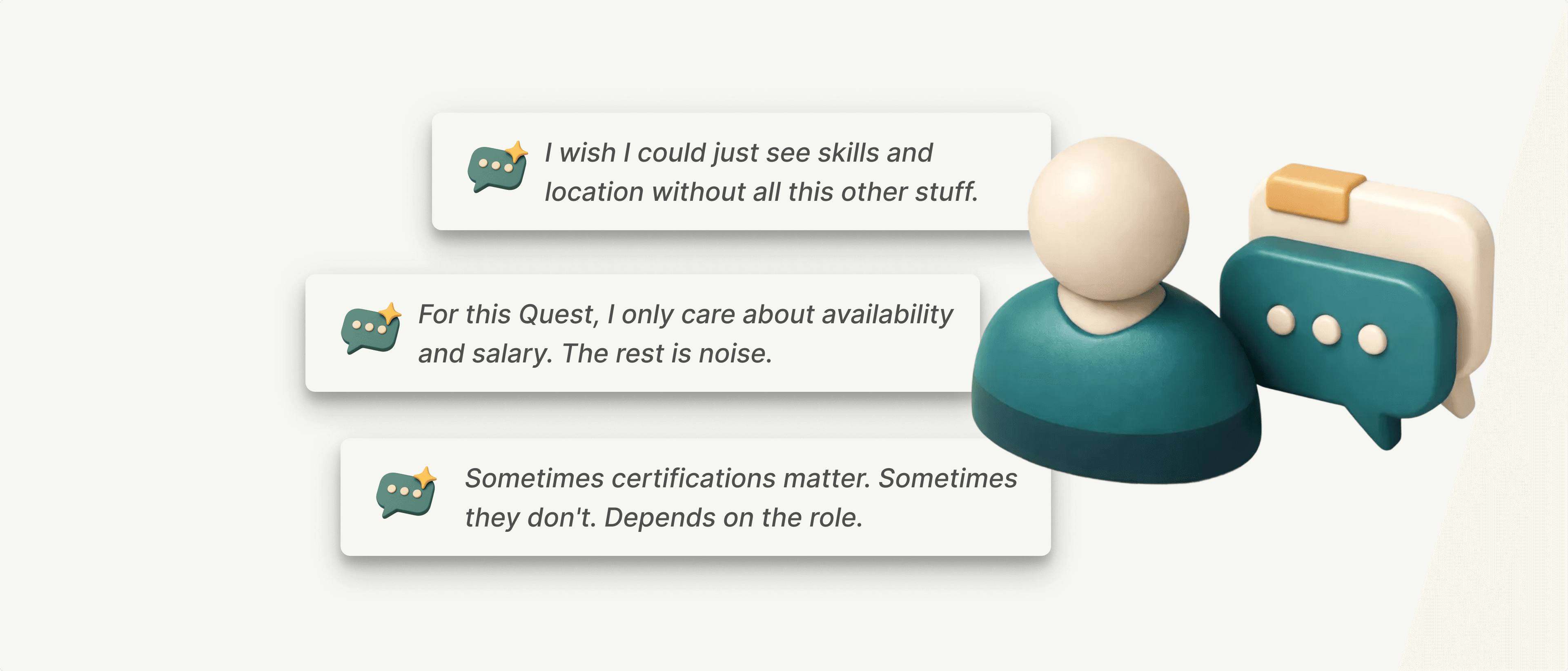
The insight: A fixed card layout was never going to serve everyone. The information recruiters needed changed with every Quest, sometimes with every candidate.
The Spark
The Data Already Existed in Rows and Columns
While observing workarounds, I noticed something. Recruiters weren't just exporting to spreadsheets for comparison. They were doing most of their actual evaluation work there.
They'd export matches to CSV, then spend their time in Excel or Google Sheets. Hiding columns. Sorting by fields. Filtering to what mattered. The flexibility they needed wasn't in our product, but it existed in every spreadsheet tool on the planet.
That was the spark.
Recruiters were already thinking in rows and columns. Our card-based interface forced them to translate that mental model into something else. The CSV export wasn't a workaround. It was a signal. The data was already tabular. We just weren't showing it that way.
What if the interface matched the shape of the data? What if recruiters could see matches the way they saw them in Excel, but without leaving the product?
The Reframe
Comparison Requires Structure
The problem was never "too much information." Recruiters needed all that data to make good decisions. The problem was how we presented it.
Cards are built for isolated evaluation. You look at one thing, judge it, move on. But recruiting isn't about evaluating candidates alone. It's about comparison. Who's strongest on skills? Who's flexible on location? Who's available soonest?
The reframe: Stop optimizing the card. Change the container entirely.
If recruiters think in rows and columns, give them rows and columns. If they need different views for different Quests, let them configure what they see. If comparison is the job, make comparison effortless.
The Solution Overview
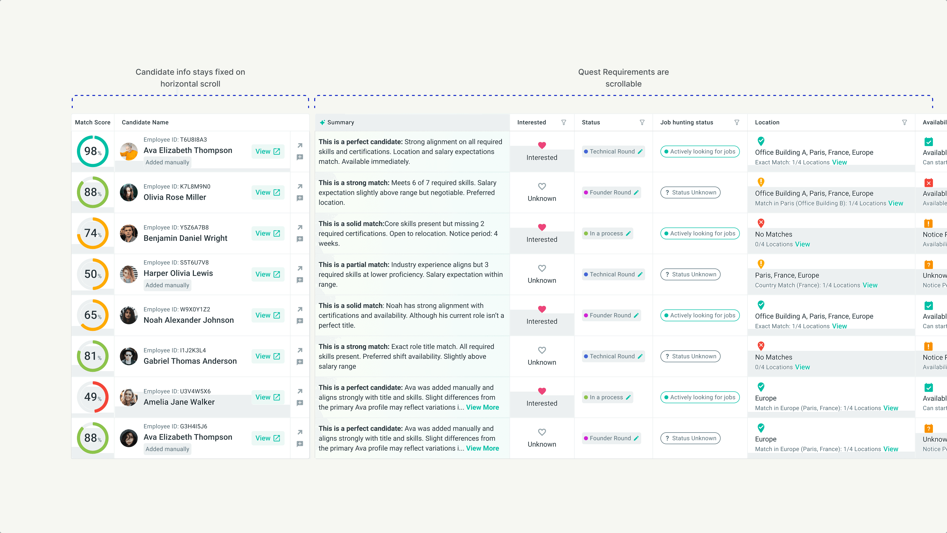
Match Tables: Built for Comparison
We replaced the card-based match view with a customizable table. Candidates as rows. Requirements as columns. Everything visible, comparable, configurable.
But this wasn't just a layout change. We designed an entire evaluation system around three modes of working:
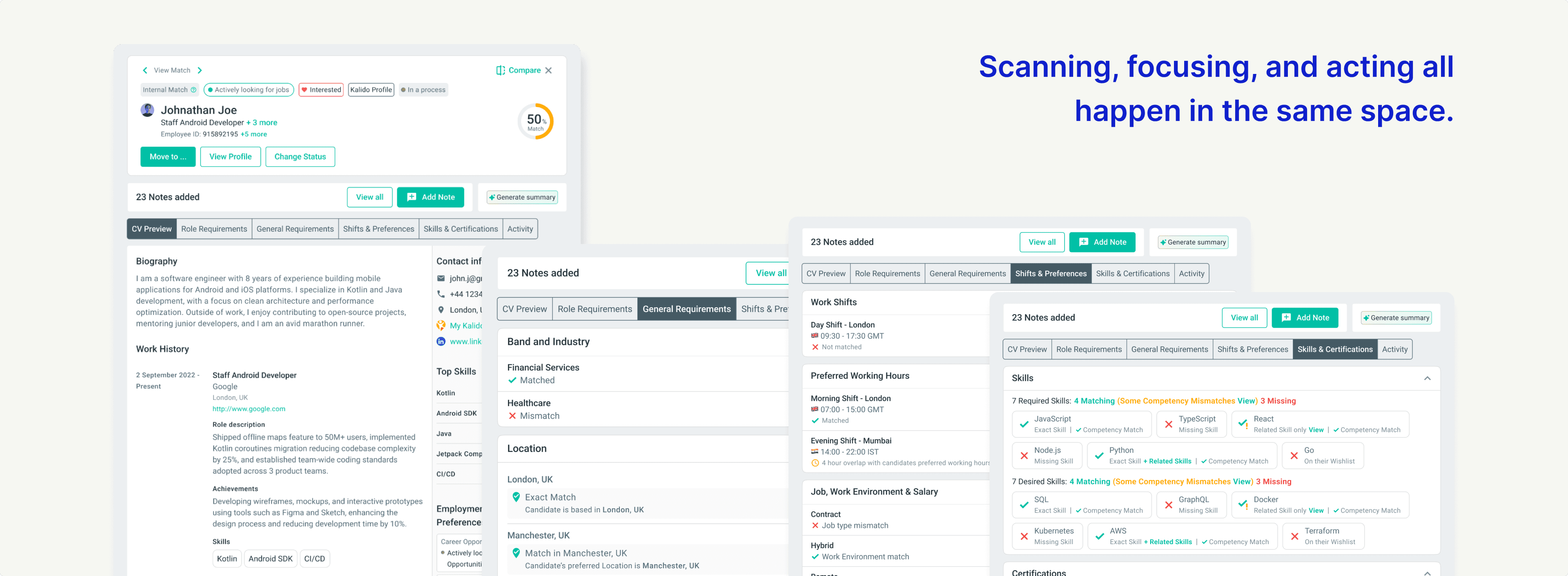
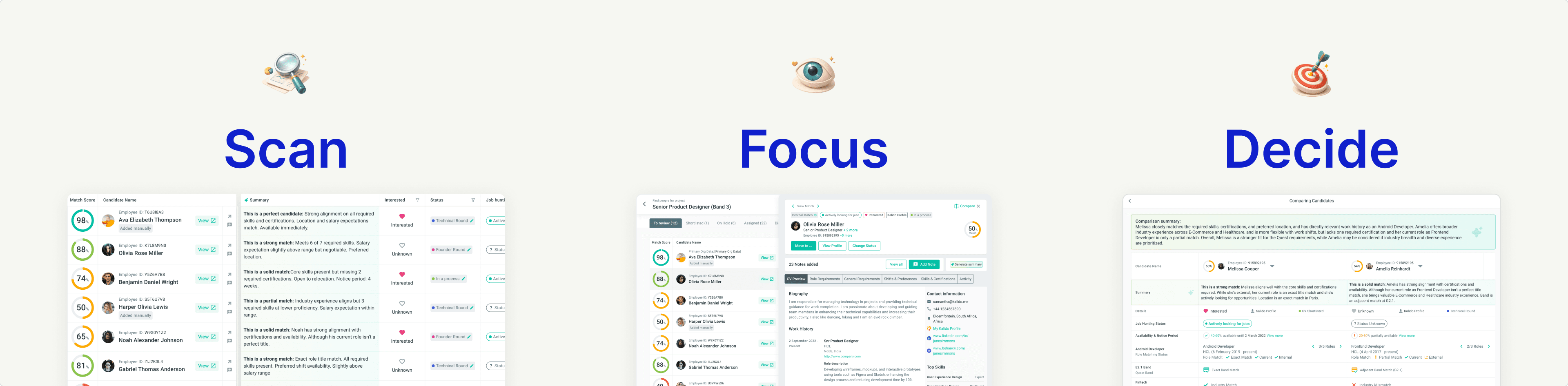
Scan. The table lets recruiters see 10+ candidates at once, with columns relevant to this Quest. Spot patterns. Identify standouts. Eliminate mismatches quickly.
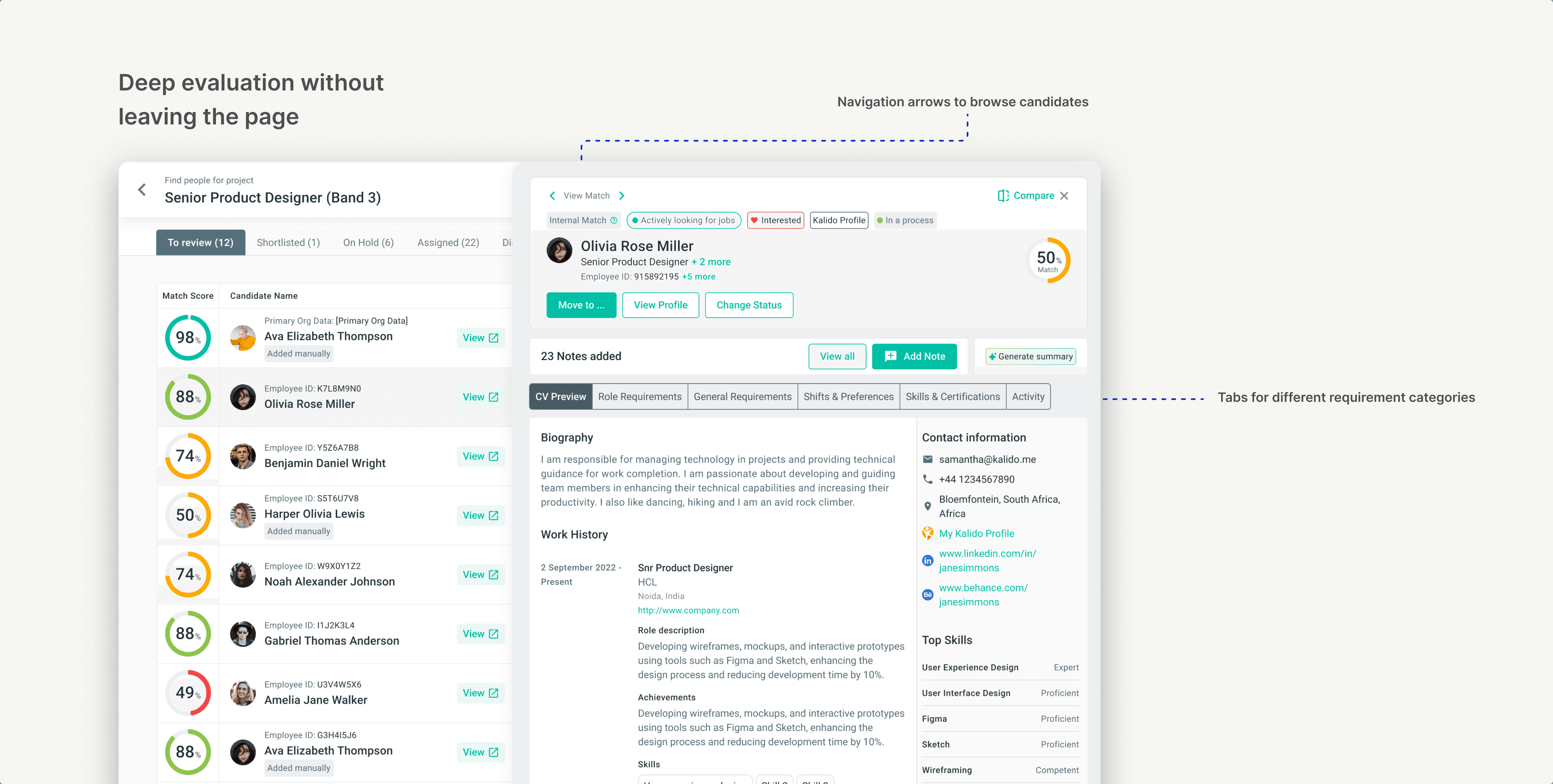
Focus. When a candidate looks promising, open the Full View panel. Deep evaluation without leaving the page. CV, requirements breakdown, notes, activity, all in one space.
Decide. Choosing between two strong candidates? Compare them side-by-side, requirement by requirement, with AI-generated summaries that call out the differences.
The system adapts to the recruiter's workflow, not the other way around.
Core Table Architecture
Fixed Left, Scrollable Right
The table needed to handle 18+ columns of data without becoming overwhelming. We split it into two zones:
Fixed columns on the left: Match score and candidate name always stay visible. No matter how far you scroll horizontally, you never lose track of who you're looking at.
Scrollable columns on the right: All requirements and candidate details live here. Role match, band, location, skills, certifications, salary, shifts, job preferences. Scroll to see what you need.
This structure solved the core tension: show everything, but don't overwhelm. Recruiters could scan across 15 requirements without losing context on which candidate they were evaluating.
Scroll and Interaction Logic
Small Decisions That Prevent Big Frustrations
Tables with many columns can become disorienting. We sweated the details on scroll behavior:
Horizontal scroll activates on hover. When your cursor is over the table, scroll left and right through columns. When you're outside the table, normal page scroll resumes. No accidental horizontal scrolling while navigating the page.
Scroll positions are independent. If you scroll horizontally to see "Salary" and then scroll down through candidates, your horizontal position stays put. You don't get reset every time you move.
These aren't flashy features. But they're the difference between a table that works and a table that fights you.
Customization
Your Quest, Your View
Remember the core insight? Every recruiter prioritizes different requirements depending on the role. A fixed table layout would repeat the same mistake as the fixed card layout.
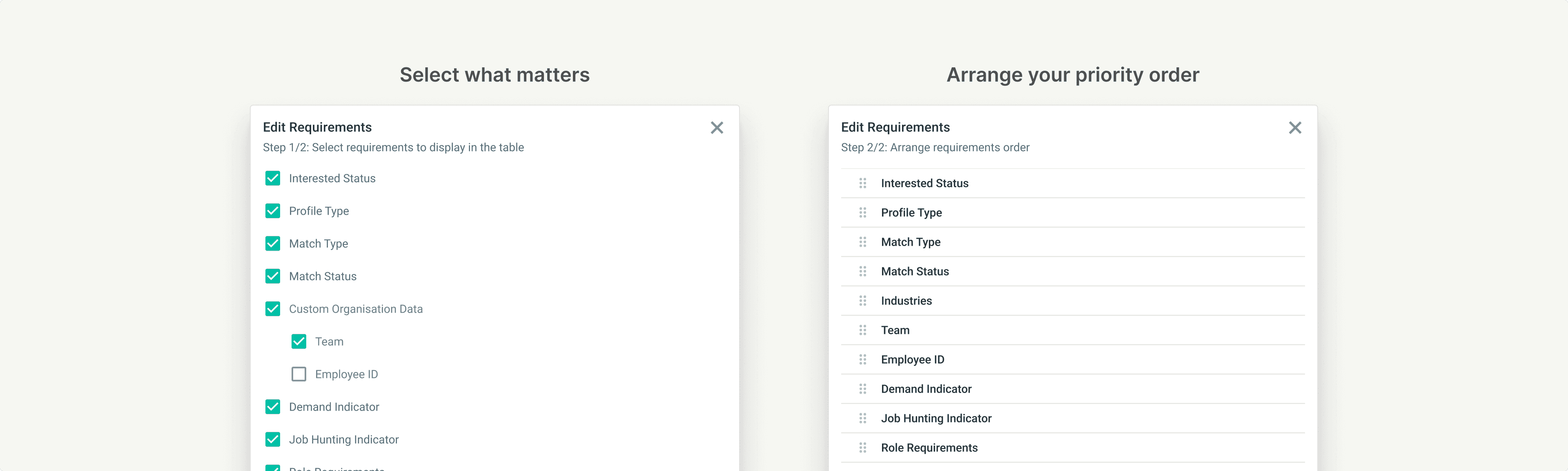
We built a two-step customization flow:
Step 1: Choose what to show - A checklist of every available column: interested status, profile type, role requirements, band, location, shifts, skills, certifications, salary, custom organisation data. Check what matters for this Quest. Uncheck the noise.
Step 2: Arrange the order - Drag columns into the sequence that matches your evaluation flow. Want skills first and location last? Done. Want salary right after role match? Your call.
The table remembers your preferences per Quest. A technical hiring Quest can look completely different from a regional staffing Quest, because the job is different.
Full View Panel
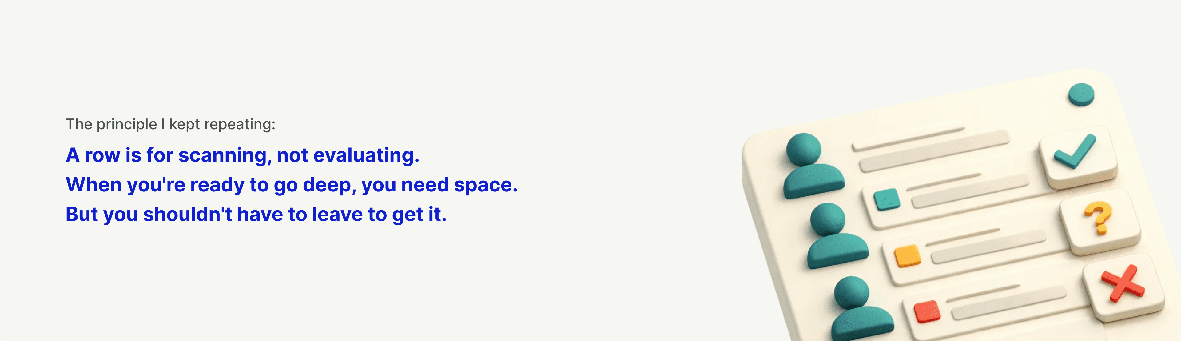
A Row Is for Scanning, Not Evaluating
The table solved comparison. But at some point, recruiters need to go deep on a single candidate. Skills are one thing, but what about their work history? Their CV? Notes from previous conversations?
A table row can't hold all that. And it shouldn't try.
I advocated for a dedicated Full View panel. When a recruiter clicks "View" on any candidate, a right-hand panel slides open with everything they need for deep evaluation:
CV preview with work history, education, and contact details
Detailed breakdown of how the candidate meets each requirement
Tabs for role requirements, general requirements, shifts and preferences, skills and certifications
Notes from the team and activity history
The table row stays highlighted so you don't lose your place. Navigation arrows let you move through candidates without closing the panel.
Everything in One Space
No More Tab Juggling
Before Full View existed, recruiters who wanted to see a candidate's complete profile had to open it in a new browser tab. They'd flip between the match list and individual profiles, losing context with every switch.
Full View eliminated that.
The Candidate's full CV: Work history, education, certifications, contact details, skills with proficiency levels, biography, affiliations. Everything they've added to their profile, visible without leaving the page.
Requirement-by-requirement breakdown: Work history, education, certifications, contact details, skills with proficiency levels, biography, affiliations. Everything they've added to their profile, visible without leaving the page.
Requirement-by-requirement breakdown. Full View doesn't just show candidate data. It shows how that data maps to the Quest:
Quest role vs. candidate's current and past roles
Quest band level vs. candidate's band
Quest location vs. candidate's location and flexibility
Quest shifts vs. candidate's shift availability and preferred working hours
Quest salary range vs. candidate's salary expectations
Required skills vs. candidate's skills (with competency match indicators)
Desired skills vs. candidate's skills
Required certifications vs. candidate's certifications
Desired certifications vs. candidate's certifications
Industry requirements vs. candidate's industry experience
Every minute requirement listed in the Quest, matched against every minute detail in the candidate's profile. No guessing. No mental math.
Actions without leaving: Move candidates to different stages, change status, add notes, generate AI summaries. The goal was simple: a recruiter should never need to leave this page to do their job.
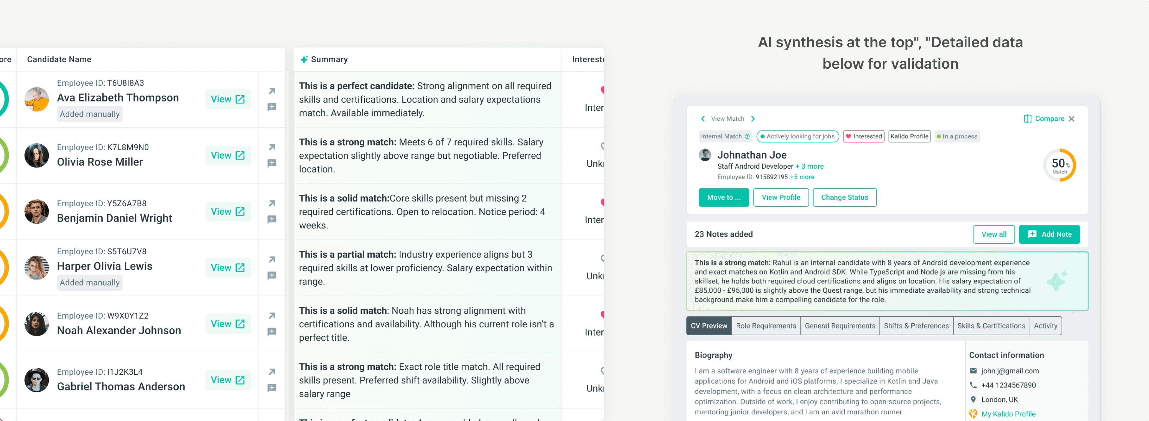
AI Summaries in Context
Not a Replacement, a Starting Point
The summaries aren't meant to make decisions for recruiters. They're meant to accelerate the path to a decision.
A recruiter scanning 30 candidates can quickly spot which ones are worth a deeper look. The "partial match" candidates might get dismissed faster. The "perfect candidate" summaries earn a Full View click.
In Full View, the summary sits above the detailed requirements breakdown. Read the AI's take first. Then validate it against the actual data if you want to go deeper.
This layered approach respects recruiter expertise while reducing cognitive load. The AI handles synthesis. The human handles judgment.
Comparing Candidates
Side-by-Side, Requirement by Requirement
Sometimes it comes down to two candidates. Both are strong. Both have tradeoffs. The table helps you spot them, but the final decision needs a closer look.
We built a dedicated Compare view. Select two candidates from the same tab, click Compare, and see them side-by-side with every requirement laid out as a row.
Match score. Interested status. Availability. Role match. Band. Location. Skills. Certifications. Salary expectations. Each row shows both candidates with clear match or mismatch indicators.
No scrolling back and forth. No holding information in memory. The comparison is the interface.
AI-Powered Comparison
Let the AI Articulate the Tradeoffs
Raw data shows the differences. But recruiters still need to weigh them. Is a skill gap more important than a location mismatch? Does industry experience outweigh a missing certification?
We added an AI comparison summary that articulates the tradeoffs in plain language.
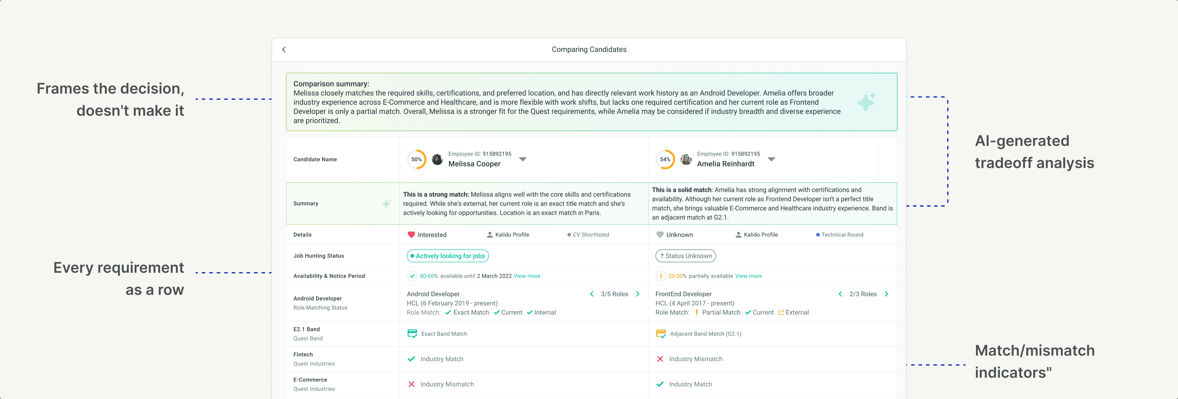
The AI doesn't make the call. It frames the decision so the recruiter can make the call faster.
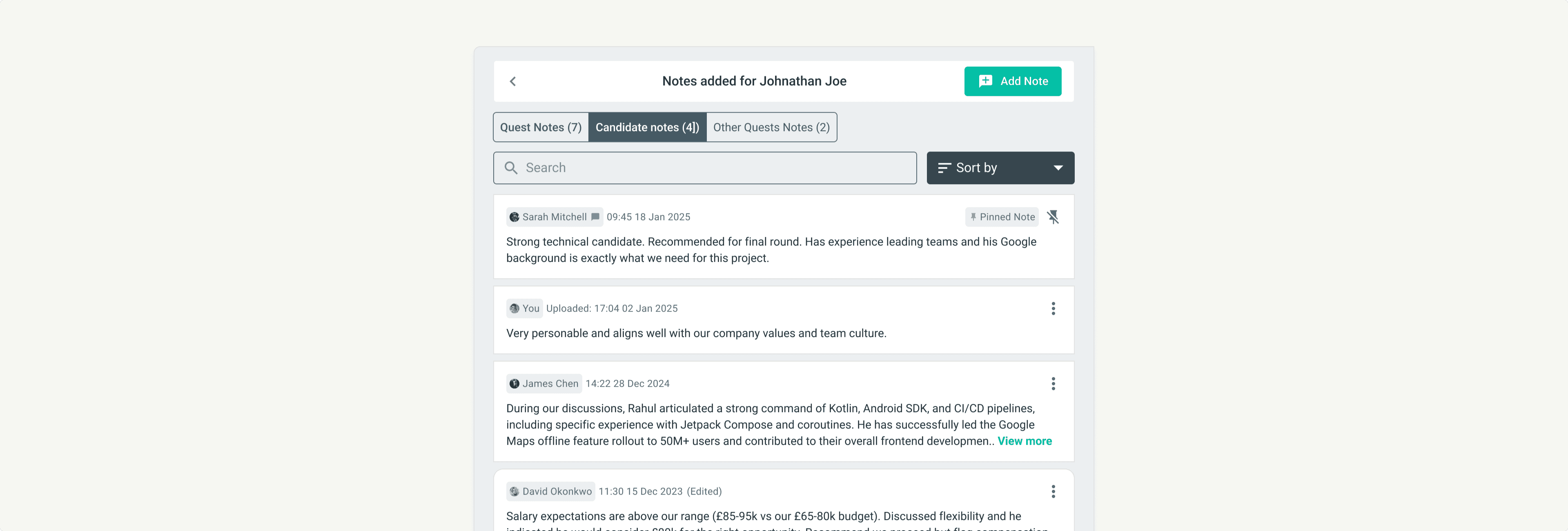
Notes and Collaboration
Notes Existed. The Experience Didn't.
Notes weren't new. The old card system had them. But they lived at the bottom of the card, accessed through a popup. When a candidate had many notes, recruiters had to click through a cramped modal while losing sight of the candidate details they were trying to reference.
It worked, technically. But it was clunky enough that people avoided using it.
In the new system, notes live inside Full View as a dedicated panel. Click "View Notes" and the notes slide in alongside the candidate's profile. Browse through feedback from colleagues while still seeing the candidate's match score, role fit, and key details.
Three categories for context:
Quest Notes. Feedback specific to this role. "Strong technical skills but salary expectations might be too high for this band."
Candidate Notes. Context that follows the candidate across any Quest. "Great communicator. Interviewed well for the London role last quarter."
Other Quests Notes. Visibility into feedback from other roles this candidate was considered for.
Notes are searchable, sortable, and pinnable. The experience went from "technically possible" to "actually usable." Less disruption. More context. Recruiters picking up where someone else left off can get up to speed without hunting through popups.
Advocating for Full View
"A Row Is for Scanning, Not Evaluating"
Full View almost didn't happen. It wasn't on the initial roadmap. The table was the priority, and adding a side panel felt like scope creep.
I pushed for it anyway.
My argument: The table solves comparison, but recruiting requires more than comparison. At some point, you need to go deep on a candidate. Read their CV. Understand their work history. See the full picture.
Without Full View, recruiters would still open profiles in new tabs. We'd solve one context-switching problem and leave another untouched.
The Results
We tracked adoption and behavior changes in the weeks following launch.
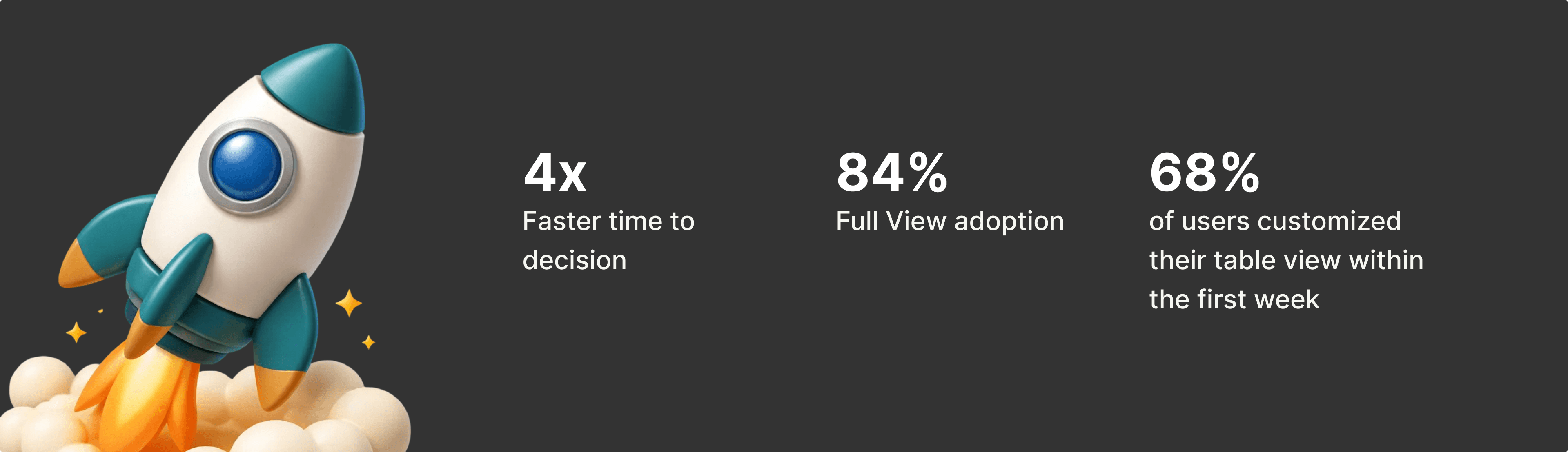
4x faster time to decision. Average time to shortlist a candidate dropped from 12 minutes to under 3 minutes. The structured format let recruiters scan, compare, and act without wrestling with the interface.
84% Full View adoption. Nearly everyone who reviewed matches used the deep evaluation panel. Recruiters no longer opened candidate profiles in separate tabs. Validation that the feature earned its place.
68% of users customized their table view within the first week. The flexibility wasn't a nice-to-have. Recruiters actively configured their workspace for different Quests, proving the core insight: every recruiter prioritizes differently.
The Qualitative Signal
Numbers tell part of the story. Recruiter feedback told the rest.
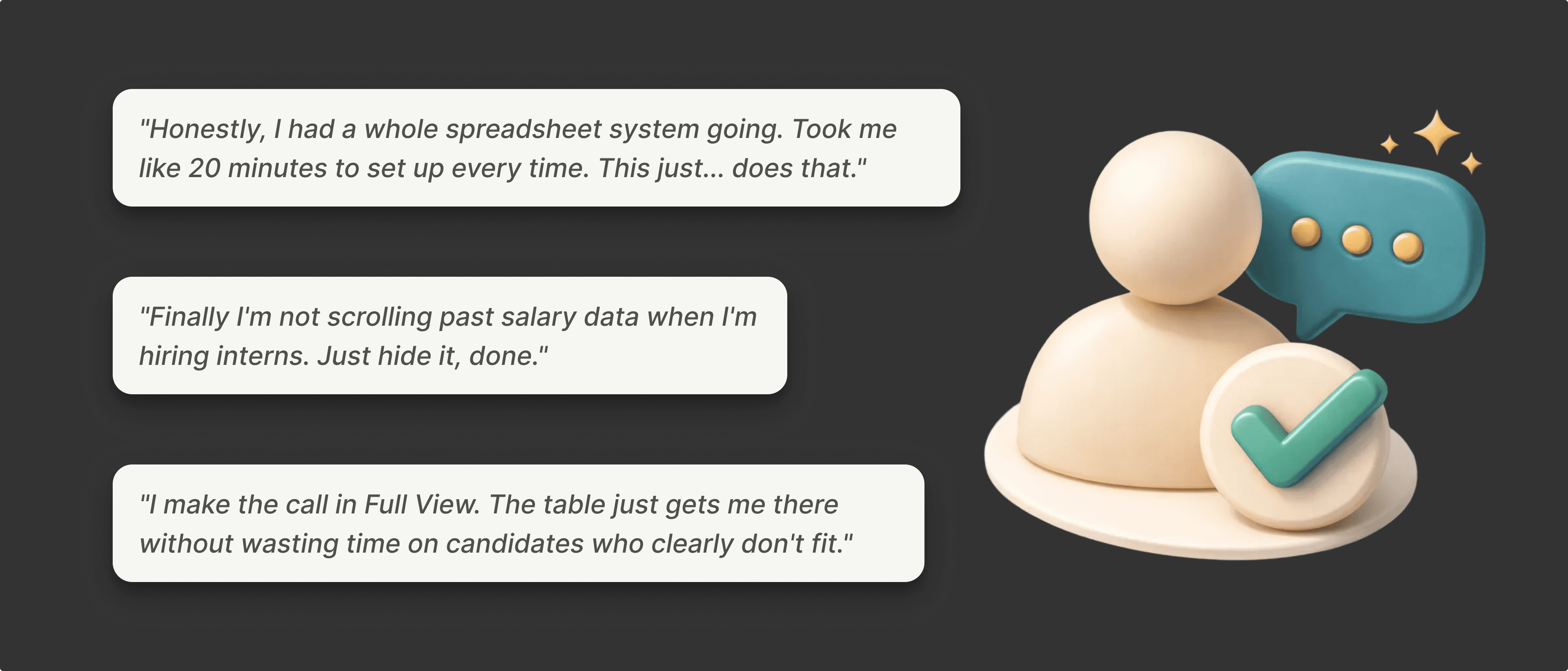
The pattern in feedback was consistent: recruiters felt like the tool finally worked the way they worked. Comparison was effortless. Customization meant no more wading through irrelevant data. Full View meant no more tab juggling.
The workarounds disappeared because the product did the job.
My Learnings
1. Watch what users do, not just what they say. Recruiters never asked for a table. They asked for "a better card" or "faster loading." But their behavior told the real story: exporting to CSV, screenshotting into PowerPoint, building comparison views elsewhere. The workarounds revealed the actual need.
2. The data already exists. Sometimes the job is just reshaping it. We didn't need new information to solve this problem. The matching data was already structured as rows and columns. Recruiters were already thinking that way when they exported to spreadsheets. The insight was recognizing that the interface should match the shape of the data.
3. Density needs escape hatches. Tables are efficient for scanning, but terrible for deep evaluation. Full View exists because a row can't do everything. When you compress information, you need a place for users to expand it.
Want the full story?
This is the highlights reel. The full project included tab-specific designs, edge cases, scroll interaction frameworks, and detailed engineering handoff specs. Happy to go deeper in conversation.
Let's talk. I'm exploring senior product design roles in AI-powered products and complex workflow tools. If that's what you're building, hit me up!


